The Influence of Colors on the Sense of Space in Minimalist Design
The Significance of Color in Minimalist Design
Colors do more than just please the eye; they can profoundly affect our perception of space. In the realm of minimalist design, the careful selection of colors serves to enhance or diminish our sense of space, creating environments that feel expansive or intimate. This exploration of color not only delves into its aesthetic appeal but also examines its psychological impact on our lives.
Key Influence of Colors
- Light Colors: Shades like whites, creams, and pastels can make a room feel larger. These colors reflect more light, which creates an illusion of openness. For example, a living room painted in soft ivory or a pale sky blue can contribute to a breezy atmosphere, making the space seem boundless and airy. This is particularly beneficial in smaller apartments or urban lofts, where maximizing perceived space is essential.
- Dark Colors: Deep hues such as navy blue, charcoal gray, and forest green tend to absorb light, often leading to a more cozy, enclosed feeling. While some may view dark colors as limiting, they can also create intimate environments that promote relaxation and comfort, ideal for bedrooms or reading nooks. Consider a study adorned in rich burgundy or an intimate library space boasting dark wooden walls; these environments can foster concentration and tranquility.
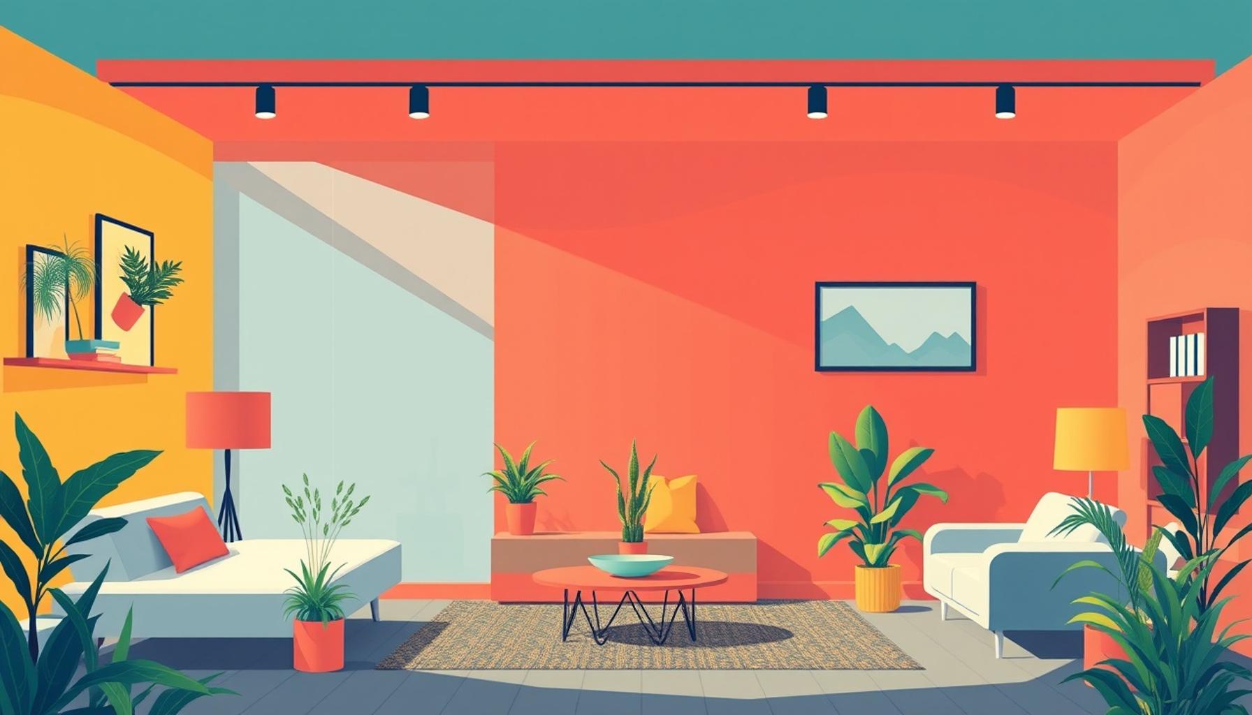
- Accent Colors: Strategic pops of color can draw attention to specific areas, altering our perception of depth within a room. A bright orange art piece hanging on an otherwise neutral wall can create a focal point that energizes the space. Additionally, utilizing accent colors effectively can guide the flow of movement, making a long corridor feel dynamic and inviting.
Furthermore, cultural associations with colors significantly deepen their impact in design. In the United States, shades of blue are frequently linked to feelings of tranquility and serenity, making them popular choices in spaces meant for relaxation, such as spas and bedrooms. Conversely, vibrant reds can stimulate energy and passion, often incorporated into kitchens or dining areas to promote sociability and appetite. Such color choices not only influence the emotional atmosphere but also shape the ways we engage with our surroundings, prompting us to consider how color can be leveraged in our own spaces.
Understanding the impact of color in minimalist design opens a new dimension of possibilities in architecture and interior design. Colors can act as the silent architects of our spaces, subtly influencing mood and perception. This article aims to unravel the nuances of color choice, illuminating how an effective utilization of hues can transform a space entirely and enhance our daily lives. By embracing the psychology of color within minimalist frameworks, designers and homeowners alike can create environments that are both aesthetically pleasing and conducive to well-being.
DISCOVER MORE: Click here to transform your workspace
The Role of Color in Spatial Perception
In minimalist design, color is not merely an aesthetic choice; it is a powerful tool that can alter our perception of size and space. Through deliberate color selections, designers can manipulate our emotional responses and the way we experience an environment. The interplay between color and space can create a sense of openness or enclosure, directly impacting how we inhabit and interact within a setting. Understanding these dynamics is crucial for those looking to enhance their living or working spaces.
Spatial Illusion Through Color
The innate ability of light colors to reflect and diffuse natural light cannot be underestimated in the context of minimalist design. For instance, when light pastel colors adorn the walls of a room, they create an illusion that expands the space. A light, airy palette, including shades like pale mint or soft lavender, fosters an environment of calmness and brightness, making it favorable for small apartments or studios where every inch matters. The visual efficacy of such hues is not just about appearance; it harmonizes with the minimalist ethos by promoting simplicity and tranquility.
- Pale Neutrals: Soft beige or light gray can serve as a canvas that allows furniture and decor pieces to pop, adding depth and contrast without overwhelming the sense of space.
- Translucent Touches: Incorporating sheer curtains in light-colored fabrics can enhance the perception of spaciousness by filtering sunlight while preserving privacy.
- Reflective Surfaces: Using glossy finishes or mirrored elements with light colors can further amplify the effects of brightness, creating a dynamic sense of openness.
On the other hand, the application of dark colors in minimalist spaces beckons a different effect. While commonly perceived as constricting, darker hues can evoke sophistication and coziness, especially in areas meant for relaxation, such as bedrooms or private reading nooks. To illustrate, a space enveloped in deep charcoal or rich navy can invoke a sense of security and warmth, creating an intimate retreat away from the hustle and bustle of daily life. A well-designed minimalist study with dark walnut paneling, for example, can foster concentration and creativity, proving that depth is just as impactful as breadth.
Color as a Guide
Additionally, the incorporation of accent colors, used judiciously within any minimalist framework, plays a pivotal role in shaping spatial perception. Accents can guide the viewer’s gaze and enhance the overall flow of the design. For example, a striking piece of artwork or a vivid throw pillow can draw attention to a specific area, thereby altering one’s perception of the room’s dimensions. By using accent colors strategically, designers can create focal points that break up large expanses of color, allowing for a dynamic exploration of space and form.
Considering cultural associations also enhances the understanding of color’s impact on spatial perception. In the United States, soft blues and greens are often associated with tranquility, making them popular choices for baths and relaxation spaces. In contrast, vibrant colors, such as fiery reds and sunny yellows, are thought to elevate energy levels, suitable for interactive spaces like kitchens and dining rooms. Such color selections not only shape our emotional experiences within a space but can also dictate the way we connect with it physically and psychologically.
Through this nuanced understanding of color psychology and its influence on spatial perception, minimalist design can be significantly enriched. The right color choices can craft environments that not only look good but feel good, inviting inhabitants to engage deeply with their surroundings.
The Role of Color Psychology in Minimalist Spaces
In the realm of minimalist design, color plays a pivotal role in shaping our perception of space. The psychology behind colors extends beyond mere aesthetics; it influences emotions, behavior, and the very atmosphere within a room. For instance, lighter hues such as whites and pastels can make spaces feel expansive and airy, creating a sense of openness. This effect is particularly beneficial in small apartments or studios where maximizing space is paramount. In contrast, deep colors can create intimacy but risk making a room feel smaller if not balanced appropriately.Additionally, incorporating strategic color splashes against neutral backdrops not only draws attention but also adds dynamism to minimalist spaces. Select accents—like a bold red chair or vibrant artwork—can act as focal points, allowing for a delicate interplay between simplicity and impact. Such contrasts help in breaking the monotony that often accompanies minimalist environments.
Creating Ambiance Through Color
The ambiance created by colors can significantly alter our experience in a space. For example, shades of blue are known to evoke tranquility, making them ideal for relaxation areas like bedrooms or meditation spaces. On the other hand, bright yellows can invigorate a kitchen or a workspace, enhancing creativity and energy. This intentional selection of colors not only aligns with the principles of minimalist design but also enhances the functionality of each room.Moreover, natural light’s interaction with colors cannot be overlooked. Minimalist designs often prioritize large windows and open layouts to maximize daylight. When this light filters through colored surfaces or textiles, it changes the way we perceive the space throughout the day. A room painted in soft gray, for example, can appear dramatically different as the sunlight shifts, highlighting the importance of considering lighting conditions in color choice.
Exploring Cultural Perspectives on Color
It is essential to acknowledge how cultural perspectives influence color perception in minimalist design. Different cultures may associate varying meanings with specific colors, affecting how spaces are felt and used. Japanese minimalism, for instance, might favor organic and earthy tones to foster a connection with nature, embodying the concept of “wabi-sabi”—an appreciation for beauty in imperfection. In contrast, Scandinavian designs often utilize light and airy colors to reflect the surrounding landscapes, promoting a sense of calm and simplicity.These nuances illustrate that color influences not only the visual aspects of minimalist design but also the emotional and cultural narratives within spaces. Understanding these dynamics invites us to explore how intentional color choices can transform minimalist environments into personalized sanctuaries, harnessing the intrinsic link between colors and space perception.
| Category | Benefits |
|---|---|
| Perception of Space | Lighter colors expand the sense of space, while darker tones create intimacy. |
| Emotional Impact | Colors influence mood and can enhance various activities such as relaxation or creativity. |
Exploring these topics not only deepens our understanding of minimalist design but also enriches our experiences within these thoughtfully curated spaces. As designers and homeowners alike delve further into color’s influence on the sense of space, they uncover new possibilities for creating personalized and meaningful environments.
DIVE DEEPER: Click here to learn more
Creating Mood and Atmosphere with Color
In minimalist design, the deliberate use of color psychology further influences the atmosphere of a space, shaping not only how we perceive the dimensions around us but also our emotional experience within those settings. For instance, certain colors are linked to specific emotions and actions. By leveraging this knowledge, designers can create an ambiance conducive to the function of the room. In spaces dedicated to focus and productivity, such as home offices, cool colors, like blues and greens, are often employed. These hues are known for their calming properties, which can reduce stress and boost concentration.
Warm Colors and Their Enveloping Effect
Contrastingly, warm colors, such as soft yellows, peaches, and earthy tones, are frequently utilized in social zones, such as living rooms and kitchens. These colors evoke warmth and invite interaction, fostering a welcoming environment. The strategic use of these colors can evoke feelings of intimacy and comfort, making them particularly effective in minimalist designs that aim to maintain an open and uncluttered appearance while still generating a sense of community. A minimalist kitchen featuring creamy yellows or warm taupes can feel engaging and inviting, encouraging gatherings and conversations.
- Color Flow: An unbroken color scheme, wherein adjacent rooms share similar color tones, enhances the fluidity of space perception, allowing one’s eye to move seamlessly from one area to another.
- Color Gradation: Soft transitions between colors can contribute to a sense of spatial continuity, reducing visual barriers and promoting an extensive feel.
- Large Panels of Color: Utilizing expansive swaths of a single color can create a feeling of cohesion in minimalist interiors, making areas appear more open.
Using translucent colors in furniture design can also impact how space is perceived. Acrylic furniture, for example, painted in light tints, can contribute to an airy, floating effect, framing the room without visually taking up much space. Functional items become less like obstacles and more like elements that enhance the openness of a setting. This is especially vital in urban apartments where maximizing space is a constant challenge. Utilizing lighter colored acrylics or glass allows light to flow around objects, decreasing visual clutter while maintaining a stylish minimalist aesthetic.
Trends in Color Use
Recently, there has been a growing trend towards incorporating biophilic design elements into minimalist spaces. This approach emphasizes the connection between nature and the built environment and frequently utilizes earthy greens and natural browns to mimic outdoor environments. Designers incorporate these shades into home interiors to elevate feelings of serenity and peace while also broadening spatial perceptions. This connection can be particularly relevant in the challenging environments of urban living, where homeowners look for comfort in nature-inspired color palettes.
Moreover, while accent colors can guide attention and establish focal points, they can also be employed in unexpected ways. A statement wall painted in a bold hue can compactly define a small corner of the room while allowing the remaining space to remain open and airy. This duality of color allows designers to harness both the intrigue of vibrant colors and the minimalist ethos of simplicity.
Ultimately, the integration of color in minimalist design has transformative potential. By understanding how colors interact with spatial dimensions and contribute to emotional atmospheres, designers can create environments that captivate both the eye and the spirit of the inhabitants, pushing the boundaries of minimalist aesthetics.
DISCOVER: Click here to learn how to prioritize effectively
Conclusion
The relationship between color and space perception in minimalist design is a fascinating intersection that extends beyond mere aesthetics. By understanding color psychology, designers can leverage hues to evoke specific emotions and craft environments that enhance our experiences. The strategic use of cool and warm colors can delineate spaces intended for productivity or social interaction, making them not only visually appealing but also functionally efficient.
Moreover, techniques such as color flow and color gradation create a seamless transition between areas, reinforcing the expansive quality that minimalist spaces strive for. The rising trend of incorporating biophilic elements with earthy tones adds another dimension, emphasizing our innate connection to nature—especially significant in today’s urbanized settings. As we seek refuge from the chaos of city life, these nature-inspired palettes can bring tranquility and coherence to our interiors.
In a world where space is often limited, understanding the influence of colors offers designers an invaluable tool for optimizing both spatial experience and emotional wellbeing. The function of color in minimalist design is not merely decorative; it holds the transformative potential to elevate everyday spaces into profound environments that resonate with the psyche. As we continue to explore this relationship, we invite readers to consider how color might reshape their own living spaces, inviting new possibilities in their journey towards a balanced, meaningful lifestyle.